So as to not cause any legal issues by linking or show
casing copyrighted images, this blog entry is I’m afraid very text orientated.
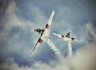
I made the mistake of creating a digital composition which did actually get me the thumbs up from a panel of judges. I had declared that it was a digital fudge, and that I had used 3 images to create the composition. However the wind was blown out of my sail when one of the panelists kindly said to me on the quite, “Excellent work on the composition, real shame you forgot to reverse the text on the underside of your left subject”. Doh!!
..Needless to say the one shown here had been fixed but too late.
Over the years I have seen some pretty bad photo
retouching and it amazes me that the most common problems still crop up today.
Just recently I was reviewing a digital image composition of
a subject. On the surface it looked really good then after about 5 seconds the
mental reality check kicked in and my mind was flooded with the “wait a minute…there
is something wrong with this image”
…and sure enough there was.
Looking closely at what appeared to be a nicely composed
landscape taken late in the afternoon started to show signs of the unreal.
Sadly too this image was supposedly being entered into a competition.
So what was wrong?, a few things. But the most noticeable one
was the moon which appeared to be evident In the early evening sky.
But that’s possible I hear you cry. And you are correct, however
the lake scene below the moon told a different story. The image was of a little
know location here in NZ called Lake Taupo, now I’m no astronomer but I reckon
the moon face came from another image and nicely dropped in, however they
obviously forgot that the moon face reflecting in the lake had a small amount
of cloud covering it, while the one sitting proudly above the lake was actually
clear and had the face most associated with the Northern hemisphere.
Of course this then lead to a couple of questions 1) Is it
In fact an image of Lake Taupo?, or 2)a lake actually in the northern
hemisphere and they just got their metadata wrong?. Both are plausible but I’m
afraid due to possibly poor cropping there was a small amount of evidence which
sealed the case.
You could just see the remains of a street sign showing
the first few letter T A U M A….
So a quick search on Google maps for Lake Taupo and yep
there you go, on the west side just down from the lake is a town called Taumarunui,
so Lake Taupo it is.
…apart from these to mistakes the digital composition was
actually very good, even thou it’s naturally inaccurate.
The next one is a very simple trap to fall into and one I have
done myself on a few occasions and that is when you isolate an object and flip
it or perhaps mirror it. Seems reasonable right? Not if you have text or
symbols on it.I made the mistake of creating a digital composition which did actually get me the thumbs up from a panel of judges. I had declared that it was a digital fudge, and that I had used 3 images to create the composition. However the wind was blown out of my sail when one of the panelists kindly said to me on the quite, “Excellent work on the composition, real shame you forgot to reverse the text on the underside of your left subject”. Doh!!
 |
| Corrected but too late |
..Needless to say the one shown here had been fixed but too late.
So if you intend to do some digital wizardry here are a
few things to remember.
1) If
you intend to include objects from other images, make sure that it is physically,
and/or naturally possible If you are going for the fantasy theme then fine
2) If
you flip, rotate, mirror check for any logos or text which might get distorted.
This can be ignored however if you are shooting reflections (i.e building,
Mirrors etc)
3) If
you merge objects together taken during good sunlight, make sure your shadows
are all going in the same direction. Most cut the shadows out al together.
4) Beware
extractions, Unless
you have staged your original photo using a green screen, it is almost
impossible to extract an image and make it fit the way it should, even for
seasoned professionals. It is best to try and create the photo you want the
first time around.
5) When you are trying to get the perfect
monochrome feature, less is often better and you may want to scale it down as
little as possible. Resorting to using sepia tones can be unnatural and will
create a photo that is muddy and overdone.
6) Smoothing or motion blurring, water,
clouds etc., even digital professionals may struggle here. So learn to use your
camera to create the photo you want you will be amazed at the results and feel
better for it.
Less Photoshop.. More Photography.
Great post Lee, You write very well and explain the issue to the point. ( Professor Monty )
ReplyDeleteWell done.
Nice Write up Lee. Even a layman like me can see what your going on about :)
ReplyDelete